Welcome to LimeSurvey 6! We're thrilled to announce LimeSurvey 6 - our latest version that's easy on the eyes and offers a fresh way in how you interact with online surveys. Intrigued? Let's dive in! The main highlights The main highlights of this new release include: A completely new design system across the platform The new default admin theme for LimeSurvey The new default theme“fruity twentythree” for the survey participant’s view The update of all question types according to the new design Lots of user interface enhancements LimeSurvey in 40+ languages The new design With our focus on your user experience, we've used global components across the platform for a consistent user experience, enabling you to navigate and carry out your tasks easily. From creating your first question to analysing complex data, every action feels a bit simpler and smoother. It is a big step forward in bringing in more clarity and meeting the expectations of the year (‘Fruity‘)twenty-three. The new default admin theme We've engineered a new default admin theme — minimising distractions and bringing in more clarity and focus. From the most important pages, like the dashboard, user management, and survey list, to alerts, tooltips, badges, tables, breadcrumbs, hover and focus states, pagination and buttons, sticky top bars, and back buttons, we touched it all and juiced the whole thing up. What else? Many more limes are coming your way — some minor hints to help you discover the new version. Action buttons All of them are now on the far right side of the tables. Click on the action button to check the next best actions. Survey Settings & Survey Menu We calmed down the survey menu and survey settings design and finetuned all pages from ‘Overview’ to ’Simple plugins’. Some pages still need some 🍋 and are work in progress. While on it, we also cleaned up the top bars a bit. Survey structure We've updated the user interface for a smoother experience. The sidebar, question editor, and settings are all limed up. Activate Survey & Stop Survey Survey activation is now in a straightforward popup. Stopping your survey is easier, with more guidance and user-friendly dialogues. Right-to-left orientation For our right-to-left friends 🕌🐪🏜. All good. We’ve got you covered. You can lime on us in terms of cultural inclusivity and the correct display of text. Bug fixes Apart from the above, we did at least a zillion 🐞 fixes. The new default “fruity twentythree” theme for the survey participants' view Imagine having a survey tool that not only lets you ask the right questions but also presents them in a way that makes your respondents say, "Wow, that was easy!" Stop imagining because we have revamped our world-famous fruity theme, which brings exactly that to your screen with additional color variations. In this major update, we've improved our question types and given them a new look. From simple yes/no questions to more advanced arrays, every question type has been redesigned to offer a more engaging experience for your survey participants. Now, to show you what we are talking about, here is an overview of some question types we have polished up. Remember, this is also what your participants will see. Yes/ No question type List (Dropdown) question type List (Radio) question type List with comment question type Array question type Create your first survey now!It's as easy as squeezing a lime. Sign up Create surveys in 40+ languages Unlimited number of users Ready-to-go survey templates So much more... Array (Numbers) question type Array (Texts) question type Multiple-choice question type Bootstrap buttons question type Star rating question type Ranking question type Ranking with images question type Free text question type Numerical input question type Gender question type Equation question type Date/Time question type LimeSurvey in 40+ languages Imagine reaching out to an international audience in their native language, improving engagement and the quality of your results. LimeSurvey 6 makes it a reality with support for 40+ languages. Here's how this expansion can transform your survey experience: Global Reach: With over 40 languages supported, your surveys can cater to a wider international audience. We are not monkeying (🐒) around. With 40+ languages, we are the most international survey tool, period. 🙉 Improved Response Rate: Surveys in native languages can encourage more people to participate, increasing your response rate. Better Quality Responses: Respondents will likely provide more accurate and in-depth responses in their native language. Cultural Inclusivity: Show your respondents that you value their culture by allowing them to participate in their language. Flexibility: You can easily switch between languages while creating your survey or answering one, ensuring a seamless experience. Parting words We hope you're as thrilled as we are about these new features and improvements. Now it's time to get started with version 6.And get ready to hunt for some serious responses. We hope you gather some fantastic insights. And remember: “Also embrace thee, sour survey insights, for wise man say its the wisest course.“ Happy surveying!- Jan ✌️💚🍋LimeSurvey. The LifeSurvey. Think one step ahead. Step into a bright future with our simple online survey tool Pricing & Plans Get started
- Details
- Category: Knowledge
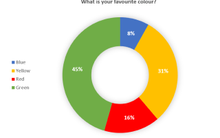
Take a look at the following assortment of the most popular and widely used chart types to get a good idea for evaluating and reporting on your own survey data. When to Use a Pie Chart single choice questions mask questions (e.g. Gender, Yes/No) Pie charts are best used when you are presenting a share of something, ideally, items explaining a single variable to benefit readability and assessment. Logically, all shares in a pie chart should thereby add up to 100%. For example, when you have binary survey responses, e.g., yes/no question types, or questions with only a few answer options/categories. Overloading a pie chart with too many categories, i.e., 6 or more, makes it hard to identify labels as well as shares and should be avoided. When it comes to data types, nominal data such as demographics, i.e., data without an order or ranking, as well as ordinal data such as Likert scale ratings, i.e., data with an order or ranking, can be visualised using pie charts. Nominal data can be arranged clockwise from largest to smallest share and ordinal data can be arranged clockwise according to ranking or rating scale. In order to increase the distinction between shares in a pie chart, strong colour contrasts or colour shades can help to achieve this. Pie charts are a nice and visually appealing solution if you are trying to show general trends rather than specific accurate data. General Tip: Avoid including "Other" as an option choice, as an answer as different responses will not be displayed in a pie chart, but will be shown as "Other". When to Use a Donut Chart single choice questions mast questions (e.g. Gender, Yes/No) Donut charts work similarly to pie charts. Donut charts have a circular cutout in the middle whereas the shares within pie charts completely fill out the middle. Despite these seemingly small differences, the way these chart types are viewed and interpreted from a psychological standpoint vary substantially. Shares of a pie chart all run to the middle and focus a viewer's attention to the centre where all pieces are processed as by the size of their areas. Shares of a donut chart however focus the viewer's attention to the length of each piece, thereby demonstrating a more linear approach of processing results. The latter way of interpreting data is naturally easier for people. Apart from that, donut charts can be used in the same way as pie charts, i.e., assessing shares of a whole. When to Use a Bar Chart single choice questions multiple choice questions arrays mask questions (e.g. Gender, Yes/No) There are several different ways to visualise data with bar charts. Most commonly used are the vertical and the horizontal bar charts. Both vertical and horizontal bar charts are composed of columns which are either aligned vertically or horizontally to the x-axis respectively. Furthermore, they are suitable to visualise nominal and ordinal data. The vertical bar chart is helpful when displaying percentages or means of only a few categories. Otherwise, too many categories would increase the width of the entire chart across a screen and make it hard to read or even display. The rule of thumb here is to reduce the categories included in a vertical bar chart to only about a handful. Compared to pie charts, bar charts facilitate direct comparison between categories, especially when ordinal data is arranged from largest to smallest column or vice versa. Furthermore, bar charts can easily display negative values which is impossible with pie charts and makes the former superior and more flexible in most cases. The horizontal bar chart comes in handy where the vertical bar chart falls short. If you have more than a handful of categories, select the horizontal bar chart as it extends vertically and improves readability.Stacked and grouped bar charts are great solutions when displaying subcategories, i.e., break down categories for a more detailed view of your data. The only difference between stacked and grouped bar charts is the way subcategories are displayed, namely subcategories in the same bar versus in different bars. General Tip: Make sure to display your bar labels horizontally, otherwise viewers have to tilt their heads to read them. Also, don't include the answer option "Other" for the same reason disclosed for pie charts. When to Use a Line Chart Single choice questions Multiple choice questions Arrays Mask questions (e.g. Gender, Yes/No) Line charts consist of data values that correspond to individual answer options and are best used to display trends, comparisons or peaks over time, therefore are great when running surveys repeatedly. General Tip: Reduce the number of labels on the x-axis to a maximum such as 5 to ensure readability; however, make sure to have enough data points to enable proper extraction of trends. Also, adjust the relative height of the y-axis to match your highest value point within the line chart to improve the visual appeal of the chart. Furthermore, do not include the answer option "Other" for the same reason disclosed for pie charts. Chart Types in LimeSurvey In LimeSurvey, for each question that is created in a survey, a chart type can be predefined in the statistics options of the respective question. If not changed, it will be set to a bar chart by default. Not to worry though, in the statistics overview after collecting survey responses, you can simply and flexibly switch back and forth between all available chart types. Besides bar, pie, donut and line charts, LimeSurvey offers a few more chart types that are not as mainstream: radar (spider) chart and polar chart. Radar charts are a great way of visualising multivariate data, i.e., data with multiple variables, on two dimensions while the variables are represented by axes starting from the same point. Thus, radar charts are beneficial when other chart types such as bar charts become rather cluttered with an increasing number of variables. Polar charts are essentially radar charts since both display data as circular graphs and can be used nicely for visualising multivariate data. However, while radar charts connect the variable results to a "web", the polar charts display results in adverse bars within the circular diagram. General Tip: Keep the number of variables in your radar or polar chart to a maximum number of 8 to avoid chart overload and confusion. Advanced Tip: If you are dealing with large amounts of survey data in general, we recommend you consider creating pivot tables to get more efficient and structured data filtering options when generating flexible and powerful pivot charts. Conclusion Learning how to use these different chart types effectively will be of great benefit not just when presenting survey results, but also and more importantly when deriving actionable measures from these results. It is always important for you to consider that your audience may not be familiar with the survey setup, i.e., structure, variables and items in detail, which makes it essential to facilitate the readability and interpretation of your survey results by choosing the most suitable chart to get your point across. Always remember: There is no one right chart to visualise your survey data. It ultimately comes down to weighing the pros and cons of each chart.
- Details
- Category: Knowledge
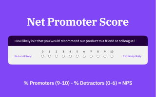
What is the Net Promoter Score (NPS)? The Net Promoter Score is an index that is a direct indication of the likelihood that a customer will recommend an organization, product, or service, and an indirect indication of customer satisfaction with an organization, a product, or a service. It provides alternative insights to traditional means for determining customer relationships, as special emphasis is placed on the aspect of word-of-mouth marketing. It is said that the NPS value is heavily linked with revenue growth and, therefore, a key metric to establish customer loyalty by a provider of a product or service. The Net Promoter Score consists of a single powerful question that simply asks “How likely is it that you would recommend company/product/service XYZ to a friend or a colleague?”. It offers an array of answer options ranging from values 0 (“Not at all likely”) to 10 (“Extremely likely”).It was developed by Fred Reichheld and introduced in 2003.* How to calculate the Net Promoter Score First, your survey respondents are divided into three groups: Those that chose answer options 0 to 6 are categorized as detractors, i.e., people who are not particularly satisfied with your products or services. Respondents who chose 7 or 8 are labeled passives who are neutrally motivated users and later ignored when calculating the Net Promoter Score. Lastly, those who chose 9 or 10 are your promoters, i.e., your loyal and satisfied customers who would gladly recommend your company and its products and services to other people. The actual NPS calculation is done in two steps. First, you need to determine the percentage of promoters and detractors: Number of promoters / Number of total respondents * 100 Number of detractors / Number of total respondents * 100 Example: You have received a total of 100 responses on your survey. 30 respondents (detractors) chose 0 to 6, 30 respondents (passives) chose 7 and 8 and 40 respondents (promoters) chose 9 and 10. 40 promoters / 100 total respondents * 100 = 40% promoters 30 detractors / 100 total respondents * 100 = 30% detractors The second calculation step is the respective NPS equation: % promoters - % detractors = Net Promoter Score The Net Promoter Score can reach a maximum value of +100(%) if you receive 100% promoters and 0% detractors and passives or a minimum value of -100(%) if you receive 100% detractors and 0% promoters and passives.Let’s take a look at our previous example and calculate the Net Promoter Score.Example: We had 40% promoters and 30% detractors. 40% promoters – 30% detractors = 10(%) Net Promoter Score Note: There is broad uncertainty about whether the Net Promoter Score is displayed as a percentage or not. The fact is, there is no specific evidence so far to determine which is better. However, there are publications by the inventor of the NPS himself, Fred Reichheld, who specifies the NPS in percent, for example, see here which is why I decided to stick to percent. What is Considered a Good Net Promoter Score? This question is not easily answered or assessed in a standardized way despite being purely numeric in determination.As mentioned before, the NPS can range from -100 to +100. If you have an equal number of promoters and detractors, you will always end up with an NPS of exactly 0. Therefore, it makes sense to treat 0 as the mean NPS, making it an average score, neither very good nor bad. Anything below 0 should sound an alarm since it indicates customer satisfaction levels are tending towards negative values, and an organization’s products, services, or processes require considerable improvement to avoid substantial customer churn.Obviously, strategy and efforts should be aimed at achieving the highest possible positive NPS score. According to global NPS standards, a score from 0 to 49 is considered “good”, a score from 50 to 69 is considered “excellent”, while a score of 70 and higher is considered “world-class”.For benchmarking reasons, pages such as Customergauge.com offer great insights into well-known brands’ NPS results. For example, Tesla Motors currently has an NPS of 97, while Apple has an NPS of 89, and Samsung, however, only manages an NPS of 70. Interestingly, the Apple iPhone has an NPS of only 55 and the Samsung Galaxy only 45, hence, making the overall brands more satisfactory from a consumer perspective than the companies' products. Tip: If you are able to retrieve information on competitors’ or industries’ Net Promoter Scores, this may give you a good starting point to work towards gaining a competitive edge. Advantages and Disadvantages of the Net Promoter Score There are plenty of advantages of conducting a Net Promoter Score survey to gain knowledge on how satisfied your customers are: Setup and processing are easy and fast due to user-friendliness. NPS question is intuitive for most respondents. The shortness of the survey reduces survey fatigue and results in a better response rate. Studies by Satmetrix and Bain & Company have shown that NPS and revenue growth are correlated. There can be good benchmarking possibilities. Customer classification can be undertaken easily. There are also disadvantages to the Net Promoter Score: It is criticized as being too general and unspecific, as it doesn’t reflect the reasons for the low satisfaction of the detractors. It’s a snapshot of the general satisfaction level but lacks natural motivation and a plan for what to do with the attained data. It fails to predict future loyalty trends. Tip: if you feel you are not getting enough information out of your NPS question data, simply extend your survey by questions such as ”Would you elaborate on why you chose {0,1,2,3,4,5,6,7,8,9,10}” and ”Which changes would have to be implemented regarding company/product/service XYZ in order for your recommendation to increase by just one point?”, each with an open text box. These additional questions extend your NPS status quo by asking customers specifically for improvement areas and enabling concrete action to spur growth. *Net Promoter Score is a trademark of Satmetrix Systems, Inc., Bain & Company, and Fred Reichheld

- Details
- Category: Knowledge
Online versus offline surveys When using surveys for data collection, you are facing multiple decisions. One of them is to choose a delivery medium. The evolution of surveys has kept up with the development of technology: going from door to door, mailing questionnaires out, calling people to complete phone interviews, using portable computers – and finally online surveys.Online surveys provide some obvious advantages such as reduced paper and administration costs. However, it makes sense to look a bit deeper into the differences between the two general options, online and offline surveys, especially with respect to the quality of the collected data. Quality of data The quality of survey results is made up of the right questions, the representativeness of the examined group of interest, and the validity and depth of the answers. Error in your data can occur systematically due to biases, like researcher bias, survey bias, respondent bias, and non-response bias, or randomly by misrepresentation.But it’s not just the accuracy of the data: Especially when surveying feedback on customers or an event experience or gathering new ideas and suggestions for improvement, the quality of free text fields is crucial for usable data. All those aspects are notably influenced by your choice of survey format. Response time and rates Online surveys most certainly produce quicker responses, since you can share the link to your survey immediately after creating it without having to call people, mail it to them or meet them in person. Offline surveys, on the other hand, usually produce higher response rates with in-person surveys being the most effective, followed by mail surveys. Online and email surveys still have a better response rate than telephone surveys.The height of response rates doesn’t necessarily translate to representation: If you want to represent the whole population of one country, you’ll need a much lower response rate than when you wish for feedback from a defined group. In a smaller group, you’ll get much smaller sample sizes and it’s much more likely to miss neutral responses and get more positive and negative results. Target group selection Most of the time, the lower response rates of online surveys can be compensated by being able to reach more people – even worldwide if you wish. With the right software, you can run a survey in multiple languages which the participants can select.If the survey has a specific target group or needs a certain frequency distribution in order to be representative, quota setting is a solution that can be used in survey software.A downside to online surveys is that random sampling is more difficult since generating random email addresses like phone numbers is not possible. That is not a problem if the group of interest consists of the members of a club, the students of a certain university, or registered customers of a shop. Otherwise, panel companies can offer a solution to getting the wished sample size.The benefits of offline interviews include going to specific places after an event to reach specific people and also reaching the computer-illiterate population. Though the “online population” used to have special characteristics like being younger, better educated, and more tech-savvy, the computer literacy has drastically increased in the last 15 years. Online surveys are thus reaching more and more people, whereas phone surveys, being still a popular medium of choice, are reaching fewer and fewer people, since households that have no landline are increasing, in particular with younger people. (Perceived) anonymity Especially upon addressing sensitive topics like smoking, drinking, sexual behavior, cheating on taxes, or gambling, self-protective answering can be observed. This means the participant is not answering honestly, downplaying, or exaggerating his or her answer. It occurs especially with an interviewer present and even depends on factors like age, gender, and ethnicity. But also when asking less sensitive questions, and instead about the experience with a product or event, the results might be biased by the presence of the interviewer in in-person interviews, since people may be more polite and less honest. This also applies to situations with an existing relationship of dependence, as often observed at universities, where the professor to be rated is present at the evaluation. Oftentimes people mistrust online surveys, when they are unsure of their data safety. Particularly if you want to prevent multiple participation, you either have to select setting cookies, saving the IP address, or only allow access with a personalized token. All those options might prevent the participants from answering upfront or from answering at all if you neglect to assure the participants of their anonymity and also choose a software tool that allows anonymization as needed.This not only concerns the data accessible to the survey creators but also to the software provider. This is why the hosting and data storage should be at best on servers within countries with high data protection legislation like Iceland, Germany, the Netherlands, or Spain. Other technical advantages Although the readability of black ink on white paper goes unchallenged, online surveys still win the victory in the design category. By not being restricted in space, it is not only possible to create a more appealing appearance with more coloring and implementation of pictures and videos but also to provide unlimited space for free text entries.To keep participants interested, online surveys allow many options for personalization, including branching to only show relevant questions, piping to reuse answers, or defining different end URLs. Though readability might be better in paper surveys, online surveys grant access to people with disabilities such as poor eyesight by being compatible with screen readers. On the researcher’s side deciphering handwriting is being skipped and fewer errors in data entry occur with online surveys. Interaction A special benefit of personal interviews arises when you want feedback on an event taking place or to ask for customer feedback immediately after the experience: Since the experience (and the excitement at best) is still fresh in their mind, the motivation to fill in a questionnaire might be higher, particularly in regards to open text fields.The interviewer bias, which has already been mentioned, can be utilized in a good way: From my own experience, face-to-face interaction can be beneficial when you are looking for answers in the form of free text fields. I learned that people often do not think of their opinion or thoughts as relevant, and so they’d rather skip a question than enter something they deem wrong. In personal interviews, you can encourage those to share their experiences. If required, you can give further explanations or ask further questions when fitting. Although offline surveys immediately after the examined experience make a lot of sense, online surveys are still superior when it comes to time management. People are often reluctant to answer at all or fill out their questionnaires as quickly as possible if they feel pressured.Did you know? When creating questionnaires with LimeSurvey, you can have respondents take your questionnaire offline with no need for internet availability. The free Android app OfflineSurveys enables caching any LimeSurvey survey and collecting your data offline. Once the Internet is available again, the app can automatically synchronize the collected responses with your LimeSurvey system. Feel free to check it out here. Conclusion The question of whether to choose an online or offline survey cannot be answered conclusively – and it does not need to be. The choice has to be made based on the particular cause depending on the survey goal and type, employee or customer feedback, academic research, or feedback to an event.In many cases, a combination of both might make the most sense, because that way you can also combine the benefits of both: broadly speaking, the number of online surveys with the quality of paper surveys and the combined accessibility of different target groups. LimeSurvey provides a convenient way to combine both: questionnaires that have been created online can be easily converted into a Word document or a PDF file. The question display is thereby adjusted in order to be used in a written or personal interview. Afterwards, the collected data can be entered manually into LimeSurvey, so that in the end both data sets can be analyzed collectively. All aforementioned features like multiple languages, data security, choosing the degree of anonymity, and personalization of the survey design are also provided by LimeSurvey.
- Details
- Category: Knowledge
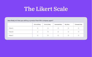
What exactly is a Likert Scale? The Likert scale or Likert-type scale, named after its inventor, the American social scientist Rensis Likert, is a usually ordinal type of psychometric rating scale that is used to capture attitudes within an agreement-disagreement range. Hence, a Likert scale is the sum of responses on several Likert options.When conducting a survey, the response on a Likert scale represents either the intensity of agreement to disagreement ("Extremely agree" vs. "Extremely disagree") with the question statement, making it a bipolar rating method, or the intensity of just an agreement or just a disagreement ("Extremely agree" vs. "Not at all agree" or "Extremely disagree" vs. "Not at all disagree") with the question statement, making it a unipolar rating method. It can be designed as an uneven-point scale, e.g., a 5-point or 7-point scale, with a neutral middle option, or as an even-point scale, e.g., a 4-point or 6-point scale, omitting a neutral option and forcing a more positive or more negative response choice. Either of these two options require full symmetry, i.e., ensuring bilateral symmetric distances from an existing or an imaginary neutral option and equal numbers of positive and negative options. How to Present Likert Scales in Online Surveys Ultimately, a Likert scale question may be arranged vertically or horizontally. However, there have been researchers investigating the possibility of something called a left-side bias when displaying a Likert scale question horizontally. Essentially, left-side bias means that when placing answer options on the left side of the Likert scale, there is a tendency among respondents to select these options, said tendency being somewhat stronger for positive options on the left side than negative options. Furthermore, there has been equivalent research showing a similar, yet even stronger selection bias for vertical Likert scales as respondents tend to skip lower displayed answer options and more often select the top options. Based on these statements, certain scale layouts appear more suitable to avoid survey bias and sloppy question answering than others. Horizontal Likert Scale: According to the Likert scale bias matrix, to keep the bias as low as possible in a horizontal order, it appears best to place negative attitude options on the left side of the scale and positive attitude options on the right side of the scale. Vertical Likert Scale: According to the Likert scale bias matrix, to keep the bias as low as possible in vertical order, it appears best to place negative attitude options at the top of the scale and positive attitude options at the bottom of the scale.In addition, Likert scales can be modified to hold 7 or more answer options depending on the level of refinement that is required for a specific question or survey. Horizontal 7-point Likert Scale: Vertical 7-point Likert Scale: Creating Likert Scales in LimeSurvey There are several possibilities in LimeSurvey to create Likert scale questions either in horizontal or vertical order. To create horizontal Likert scales with text items, you may, for instance, use the array or array dual scale question types. To create vertical Likert scales with text items, you may, for instance, use the radio button list or the dropdown list question types. When to use Likert Scales? The Likert Scale is particularly valuable when you are trying to understand complex sentiments about your product, service, or initiative. Whether you're gauging employee satisfaction, customer experiences, or public opinions. Let's say you're conducting a customer satisfaction survey. A simple yes/no question might tell you whether the customers are satisfied, but a Likert scale will reveal the extent of their satisfaction. This degree of satisfaction can be the decisive factor for product improvements, service modifications, or marketing tactics. Moreover, Likert Scales are easy for respondents to understand and complete, contributing to better response rates and less survey fatigue. Plus, they are statistically sound, giving your data analysis process robust and reliable inputs.

- Details
- Category: Knowledge
Colour psychology in survey design Have you ever wondered why you feel calm in a blue room, energized by a yellow notebook, or hungry when you see red and yellow combined in a fast-food logo? These seemingly arbitrary responses are far from coincidental—they're grounded in the intriguing realm of colour psychology. Understanding the psychology of colours Colour is not just a visual experience; even more than that it's a psychological one. Each hue in our vibrant world carries with it a psychological connotation, a subconscious message that can profoundly influence our thoughts, moods, and decisions. Welcome to the intriguing domain of colour psychology, and its compelling application within survey design and LimeSurvey. A quick overview of the meaning of colours Colours are highly attractive to us. They stimulate brain activity and are processed in the visual cortex’s colour centre of our brains. Furthermore, they are powerful influencers, as they can set a certain mood, induce physiological processes or trigger certain behaviours. In fact, there is a widespread consensus among researchers that colours are essential to fields such as marketing, market research and branding.So how does this colour psychology apply to survey design and survey-taking? To find out just that, here is a more comprehensive look at the psychological values of different colours. To provide you with a small overview of the effects of commonly used colours and colour themes, we created small palettes of the colours red, blue, green and purple for you so you can use one of the hues depicted below for your next projects. That's why we also brought up the concerning hexadecimal codes of each example. Red This bold colour is often associated with excitement, passion, and urgency. However, it can also signal danger or errors. Blue Known to inspire trust and have a calming effect, blue is a favourite in corporate and tech environments. Green This earthy colour evokes feelings of tranquillity, health, and freshness. It's commonly used in environmental and wellness contexts. Yellow The colour of sunshine, yellow, stirs feelings of happiness and positivity, but can also signify caution. Purple Often associated with creativity, luxury, and mystery, purple can add a touch of elegance and intrigue. Orange This vibrant colour is seen as friendly and energetic, often used to signal affordability and creativity. Pink This gentle hue is commonly associated with romance, femininity, and sweetness. Black Black denotes power, sophistication, and seriousness. In certain contexts, it can also suggest mystery or exclusivity. White White typically symbolizes purity, simplicity, and cleanliness. It's widely used in minimalist and modern designs. Brown This warm, natural colour is often linked to stability, reliability, and earthiness. Gray Gray signifies neutrality and balance. It can also evoke feelings of practicality and timelessness. Gold Associated with wealth, prosperity, and success, gold can add a touch of luxury and prestige. The application of colour psychology in survey design Colour psychology is a highly interesting topic for any field of use, but how do you use it inside the LimeSurvey application? Let's look at some ways you can use colour psychology to benefit your surveys, considering different overarching themes: Health and wellness surveys Use soothing colours like blue and green to create a calming environment. Accentuate with white to denote cleanliness and purity. Employee engagement surveys Warm and friendly colours like orange can encourage openness and honesty. Use blue to foster trust and loyalty. Customer satisfaction surveys Colours consistent with your brand can enhance recall. Use red sparingly to highlight important areas without inducing stress. Market research surveys Use neutral colours like gray or white to avoid influencing the respondent's feelings about the product or service being evaluated. Event feedback surveys Match the colour scheme of the event to maintain consistency and evoke memories. Vibrant colours like yellow or orange can encourage positive feedback. Academic surveys Blue can inspire trust and help maintain focus, while green can stimulate creativity and encourage innovative thinking. Environmental surveys Use earthy tones like brown or green to align with the theme. Blue can symbolize water and sky, broadening the environmental connection. Product review surveys Colours like black, purple, and gold can underscore the premium nature of the products. Also, it is usually recommended to stay within the visual identity of your brand to elevate brand awareness and recognition for your specific product. Non-Profit and social cause surveys Colours that align with the cause or the organization's logo can enhance the connection. For instance, pink can be used for women's causes, green for environmental causes, etc. Youth and trend surveys Bright and vibrant colours like red, yellow, or pink can capture the energy and dynamism of youth. These colouring options can be based on various motivations or goals. Logos with company colours, for instance, tend to aim at ensuring brand awareness and recognition. Organisational colours may dominate survey themes to elicit comfort and trust in respondents. Images within question texts or answer options may be used to visually simplify the effort for respondents when testing brand, packaging or advertisement alternatives. This is just a small fraction of possible areas where the use of colours can be applied. However, determining the extent of benefits or detriments is strongly case-dependent. Factors that determine whether colours in surveys lead to higher or lower response rates and better or worse response quality are characteristics like target audience culture, residence, age, and gender.Therefore, here are a few tips for using colours in your next survey: 6 tips for using colours in surveys As there is a lack of research dedicated to colour usage within survey design and its implications towards response rates and data quality, we can’t profess to know the right way to deal with colours when creating a survey, as there is no scientific evidence to back it. Nevertheless, we have gathered 6 valuable tips that can give you a good orientation for the usage of colours in surveys to ensure a more strategic approach. A/B Testing: If you are not certain whether to integrate specific colouring into your survey or not, there is always the possibility of A/B testing. Set up the same survey in different variations, i.e., split a survey into one with colour options and another with a more neutral look and feel. Test these on two smaller subgroups of your sample group to get an idea of which version performs better. Readability: It is essential that the text in your survey is easy to read. The lighter the font colour the harder it becomes to read. If you decide to use font colours, select darker colours, as they facilitate readability. Minimalist Design: When in doubt, go for a minimalist design when it comes to using colours in surveys rather than a maximalist design. Too many colours and images may create a cluttered effect, which looks unprofessional. Colour Contrasts: Make sure to apply colour contrasts in case you are working with background colours and font colours at the same time. I.e., avoid using the same colour for both elements, otherwise, the text might become partially or fully invisible. Colour Intuition: Avoid a response bias by making a conscious effort to not use colours in a misleading way. For example, a coloured response scale should go hand in hand with an intuitive colour distribution. I.e., a more positive response expression (e.g., “Strongly agree”) should use green colour shades and not red ones, and vice versa for a more negative response expression (e.g., “Strongly disagree”). Colour Harmonisation: From a design perspective, it makes sense to combine colours that harmonise well to maximise the quality of the survey feel. For instance, shades of the same colour will harmonise better than using two or more bright colours from different ends of the colour palette. Always keep your target audience in mind! It is vital to do your homework before splashing colours around in your survey. Always bear in mind that colours can have completely different meanings in different countries and cultures. Hence, you have to be sensitive to your target audience's cultural background to avoid pitfalls and collect the best data possible in terms of quantity and quality. Fortunately, nowadays there is a wealth of information available on colours, cultures and psychology on the internet. For example, the creative platform Shutterstock, which provides images and videos to the public, has a good grasp on colours in media, as well as the emotional effects of colour, posted in a clear and insightful article on the Symbolism of colours and colour meanings around the world.Always keep your brand, the area in which your brand is active and the target audience in mind when choosing a colour theme for your surveys. With these tips, you are good to go and can design your next survey the right way.

- Details
- Category: Security
2FA is a way to add additional security to your account. It is called "two-factor authentication" because two verification methods are used to access your account. The first "factor" is your usual password which is standard for any account. The second "factor" is a verification code retrieved from a 2FA application either from your computer or mobile device. For more details about 2FA and its importance, please visit the following article. Setting up the 2FA To see it at work, please create a free LimeSurvey account, access your LimeSurvey instance, and activate it from your Plugin Manager: Once enabled, you and your users can activate it from your own personal 2FA settings. To access them, click on the “2-Factor-Settings” menu item located on the top bar and select "2FA-Setting": On the next page, click on “Register 2FA now”: Once done, you will be prompted by the following message box: Select the 2FA authentication method. By default, five different 2FA types are provided: Google Authenticator (default), Authy, YubiKey, Authenticator Plus, Duo, and HDE OTP. Scan the QR code with your mobile phone. For a list of application recommendations, check this article. Enter the confirmation key displayed in your 2FA application (by default, a six-numeric code). Once done, click on the button "Create 2FA binding". To test it, please log out and log in again: Congratulations! You have just enhanced the security of your LimeSurvey instance! Enforce your 2FA If you wish to enforce this security measure, go to Plugin Manager, and configure the 2FA system at the global level. The following page will be loaded: Please go to the last option, enable Force 2FA, and save the changes. In this way, your users will be forced to create a 2FA key after their first login. If you have the necessary global permission, you can check under the 2FA administration panel which users are using the 2FA system (see the last column): Deactivate or reset your 2FA To deactivate 2FA authentication, go to your personal 2FA settings and click on "Unset 2FA": Confirm your action to delete the 2FA token associated with your account. Please note that you will need to re-authenticate again if "Force 2FA" is enabled from the plugin settings. In case you cannot log in anymore into your instance and you wish to reset your 2FA settings, contact your LimeSurvey instance super administrator to delete the 2FA token associated with your account. That way, you will be able to log in again to your account and create a new 2FA token. Try the plugin and let us know what are your thoughts. Join our forum discussion topic! We are looking forward to hearing your feedback! Additional Information Please note that all token authentication systems that provide time-based hash tokens work with the plugin. For more details about the plugin, please check this wiki page.

- Details
- Category: Tutorials
Export: Navigate to the overview page of your survey. Select the "Export" button from the toolbar at the top, and then choose "Tab-separated-values format (*.txt) and click the action button "Export". Import: Create a new survey in the application and choose the option "Import" ("Select survey structure file (*.lss, *.txt) or survey archive (*.lsa) (maximum file size: 40.00 MB")) and click the action button "Import survey" after you have selected the file you want to import.Download now a spreadsheet example of an entire LimeSurvey questionnaire structure that is ready to be imported into LimeSurvey and can be sent to respondents immediately. Feel free to check it out, there is more documentation on this topic in our manual.